Secret Post-Death Rituals: And What Can We Offer You Tonight by Premee Mohamed
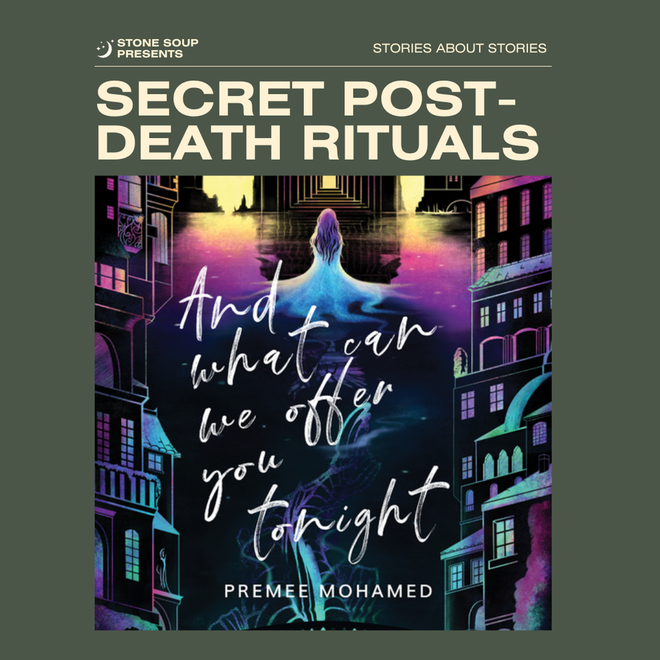
And What Can We Offer You Tonight is a stunning demonstration of how prose can be its own form of wealth. The language in this novella is richly saturated, and it cemented Premee Mohamed in my mind as an exemplar of self-possession in craft. Published by small press Neon Hemlock in 2021, this novella was thoroughly celebrated by the genre fiction community with both critical acclaim and multiple awards nominations and victories. I had the pleasure of sitting down with the team that brought the book into being to find out how a novella from a relatively young press went from idea to reality, and then to an icon of the industry.
In a far future city, where you can fall to a government cull for a single mistake, And What Can We Offer You Tonight tells the story of Jewel, an established courtesan in a luxurious House. Jewel’s world is shaken when her friend is murdered by a client and then somehow comes back to life. To get revenge, they will both have to confront the limits of loyalty, guilt, and justice.
Gailey: Premee Mohamed, how did And What Can We Offer You Tonight come to be?
Premee Mohamed, author of And What Can We Offer You Tonight: As sometimes happens, I was struck by two unrelated things touching at the same time—maybe three in this case? One was that it was August 2020 and we still didn't know much about COVID-19. I was working from home and trying (not very well) to manage a level of fear and uncertainty that I had never really experienced before. Part of how I was managing was going through any of the “Great Courses” that interested me from my public library's Kanopy access.
Gailey: Shout-out to public libraries.
Mohamed: I suspect I had been watching the one on the Etruscans, and had gotten fixated on funerary practices (religious as well as cultural or secular). The second thing was therefore a vague idea in my notes that went something like "A shunned group; their own secret post-death rituals.”
Gailey: That’s two out of three. What was the catalyst?
Mohamed: The third piece was definitely an image I found on social media somewhere of a mouldy or lichen-covered, wooden church on fire and sinking into the sea, with a kind of blue-grey, loden light over it, that really struck me. The image struck the match to the other thing (or things) and that became the "Why is this church on fire?" scene at the end of the book, and then I worked backwards from that to the church whole, secret, mouldy, too near to the water or even in the water, and the group of beautifully-dressed courtesans and a hired priest and a coffin covered in flowers—that starts the book.
Gailey: How did that combination galvanize you?
Mohamed: It was one of the fastest pieces of writing I'd ever done; it felt like it was shooting out of my head at approximately railgun speed. Then I wasn't too sure what to do with it—my agent, Michael Curry, and I agreed years ago that novellas were kind of a grey area in our agency agreement, so I could pull him in or not. I submitted it to a few of the magazines that accept novellas, got two rejections, and then the third trip out was submitting to Neon Hemlock's open period, and they picked it up.
dave ring, Publisher and Managing Editor at Neon Hemlock: So yeah, I do nearly everything behind the scenes at Neon Hemlock, unless there’s a project where I’ve brought on another editor or co-editor. That means acquisitions (reading submissions and choosing what to publish), editorial (developmental/line/copy edits), design (cover and interior—I hire out for illustrations), marketing/publicity (what there is of it), sales…everything.
Gailey: The acquisitions phase is where you first encountered Premee’s work, then?
ring: I had the beautiful experience of finding And What Can We Offer You Tonight in our second novella open submissions period. I realize now that this moment was one that happened towards the end of 2020, when my world felt at its smallest. Discovering [And What Can We Offer You Tonight] there felt like fishing something shiny from the bottom of a pool, even if the truer metaphor would require the pool to be in my yard and I should admit, I had asked people to throw shiny things into it.
Mohamed: I pulled in Michael and was like "Surprise novella! Hi!" It had what seemed like a suspiciously easy journey into the world.
Gailey: What kind of editorial journey did the manuscript end up taking?
ring: From an editing perspective, the shape of this story was quite thoughtful even before I got my greedy hands on it. Premee’s understanding of the protagonist’s voice—of Jewel’s interiority generally—was very assured. My role was one of prompting clarity and perhaps some deepening of themes.
Mohamed: When I was rejected from F&SF, the editor, C.C. Finlay, had a useful bit of feedback, suggesting the novella was beautifully written but in terms of plot, lacked something in the middle to connect two specific things at the end and beginning—I ended up adding a couple of scenes to the middle on his suggestion, because he was right (thank you Charlie!). I'm very happy with the change; it took about an hour and a half to write what I wanted to add, then weave it into the other threads before and after it, and it made for a much stronger story.
Gailey: What was it like to work with the story from there?
ring: I remember mostly not wanting to disappoint. I was still finding my feet as an editor, coming to the conclusion that a good editor was always finding their feet, and Premee was both affable and intimidating.
Mohamed: I guess I'm proud that I didn't tone down my prose or voice for the final product. As I keep learning, writerly intuition is the strongest tool we have, and we ignore it at our peril, and my intuition was telling me to just cut the brake cables on this one and write it however I wanted. And it was so inspired by Gene Wolfe's The Fifth Head of Cerberus that I felt certain that, like that book, this was something where I *could* focus on my particular obsession, which is that the way a piece of writing *sounds* to me is far more important than whether it makes sense or not.
Gailey: What made this specific book feel like a safe place to dive deep like that?
Mohamed: The main reason I felt this (again, not thought, no logic was involved) was that it was a novella. The voice was too baroque and overwrought, I figured, for a novel, but it was okay for a shorter piece. Sort of like getting a very thin slice of some ridiculous dessert. I'm proud that this turned out the way I saw it in my head. That doesn't always happen. And I'm very glad that dave was so open to leaving it as-is. I can think of dozens of editors I've worked with who are extremely lovely people, but who would have insisted that I add more plot or tone down the vibes, and I wanted it to be all vibes and no plot.
Gailey: Obviously the inside of the book is important, but once that’s locked down, the outside of the book has to come together too. How do you feel about the way those aspects of the book aligned?
Mohamed: Carly [A-F] did the incredible cover that blows my hat clean off my head every time I look at it.
ring: We had a wonderful experience working with Carly on the cover.
Carly A-F, Illustrator: dave first approached me having seen a piece I'd done about Greek myth called Persephone that had a tone similar to what they wanted for the book cover. I was delighted to be asked, especially as I was already an admirer of Premee's work. I'd read the Apple-Tree Throne not long before!
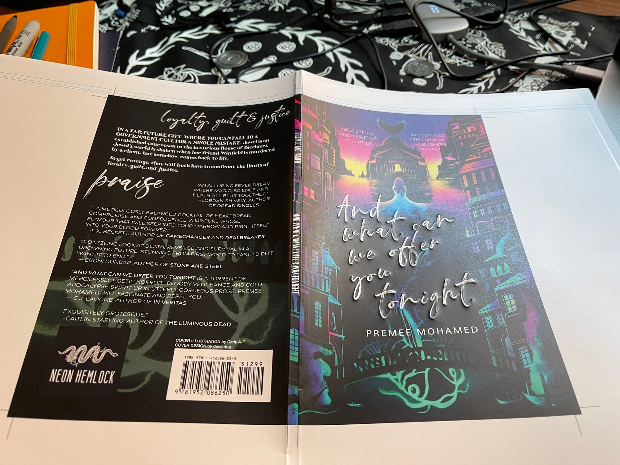
Mohamed: I love that cover, not least because it came after my previous three books (with black-and-white or black-and-red covers) and the wealth of colour made me feel like Dorothy stepping into Oz for the first time.
A-F: My goal is to create the artwork for the book cover, and to work together with the editor, art director, and graphic designer (in this case, dave ring for all!) to create the final book cover.
Gailey: How do you work toward that goal?
A-F: For any book cover project, I always start by reading the story to get an idea of not only the plot, but also the atmosphere and themes that are important. My goal is to reflect these on the cover and give the viewer an impression of the flavour of the story to draw them in. I do a lot of small sketches—called thumbnail sketches—to experiment with different ideas and compositions before choosing the strongest ones to refine into rough sketches and send over to the editor/art director and author to review.
Gailey: How do you maintain a sense of fun throughout such a granular, involved process?
A-F: The challenge and joy of any cover is to give enough story hints to intrigue the viewer and want them to read the story without revealing too much. To decide what to hide and what to show! There are also size limitations, type, names, and info to go on too, so you have to be careful to keep the composition clear, and to make sure that you balance the art with the designer's layout and have them working together beautifully—and dave did a gorgeous job on the title and layout!
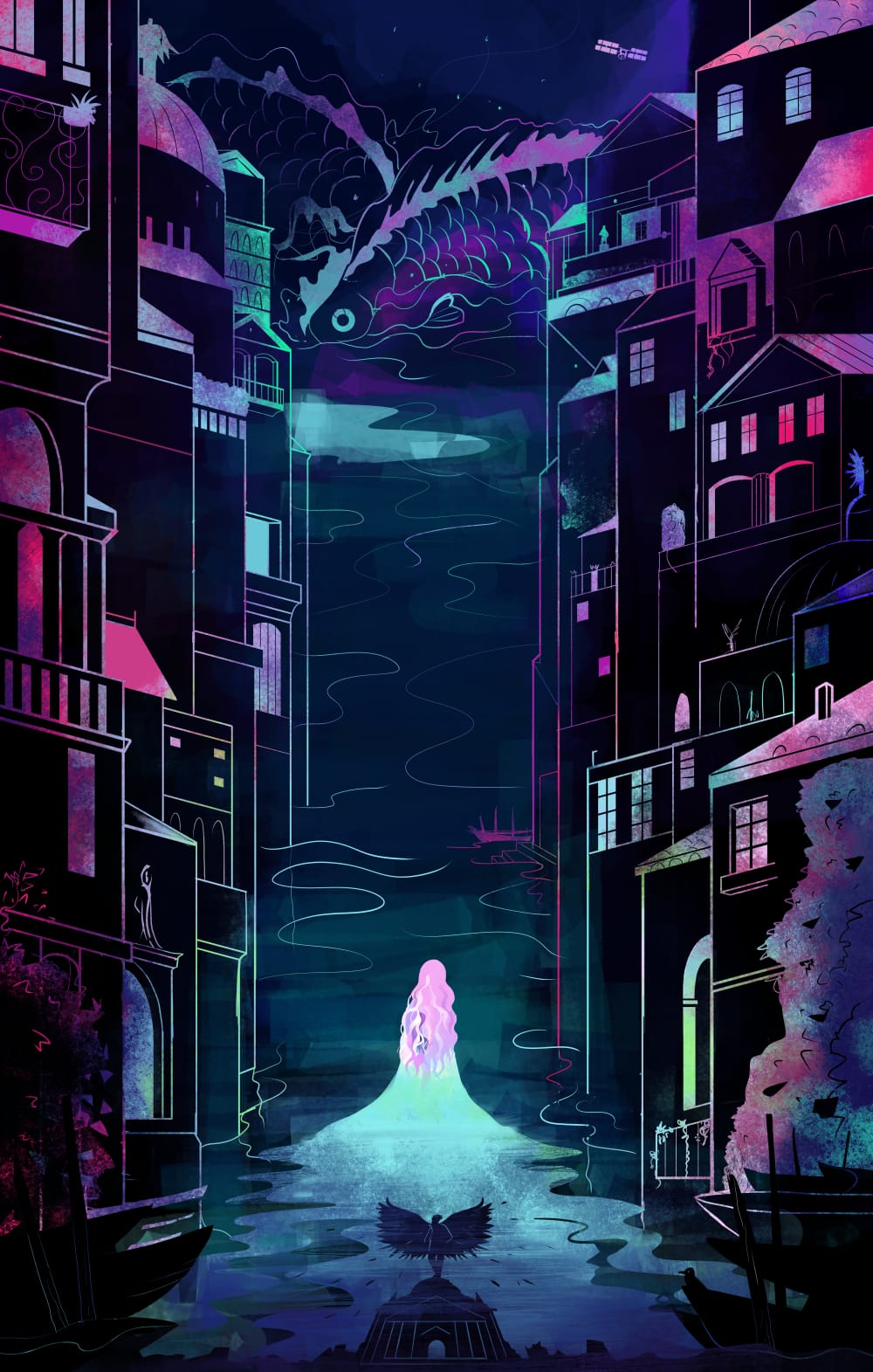
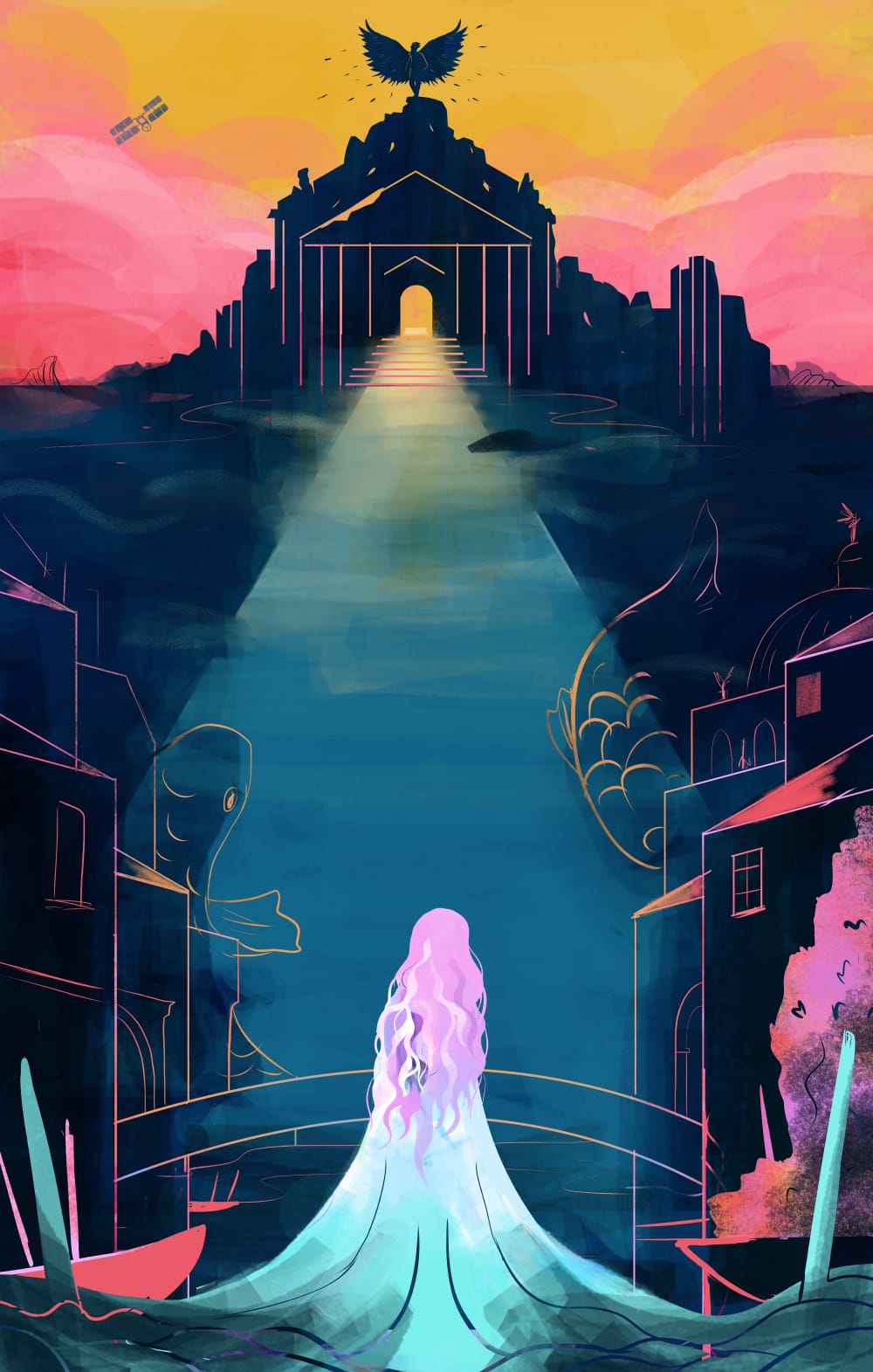
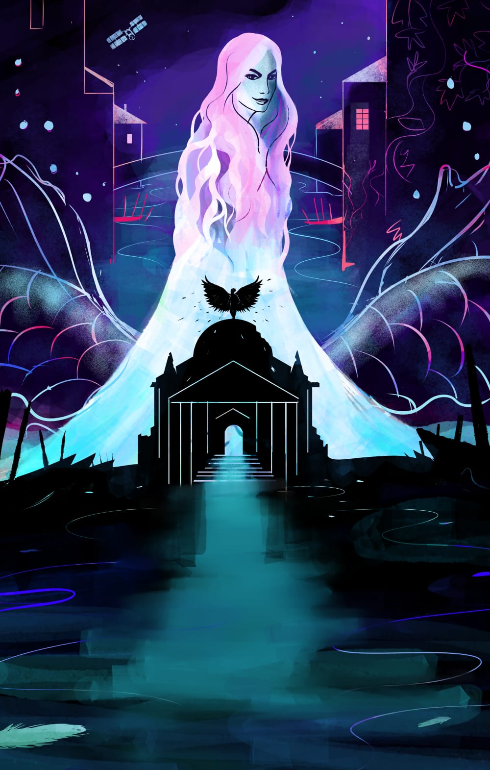
A-F: I think on this cover I really wanted to show the unique atmosphere the story has, and so for this I wanted it to be beautiful but also dangerous and unwelcoming. I used colour to show this—rich beautiful colours, but with acidic, cold undertones, like the rainbow colours on an oil spill. Premee writes beautiful moments with colour, and so I wanted to bring this forward in the art.
ring: The type on Carly’s beautiful cover is the least legible I’ve ever used for a book, but I still love it. It was another vibes-first decision, one that makes it impossible to decipher in thumbnail, but one I don’t regret. It was also the first cover we had embossed, and the raised text makes the book feel really lovely in your hands.
A-F: I was also happy with the composition. I used it as a storytelling device—the stacked architecture of the city around the sides makes a beautiful cage that the main character is breaking free of, heading towards the ruined church, freedom, and the climax of the story.
Gailey: How did the prose influence your approach to the cover?
A-F: The decorative line-heavy style of the city was inspired by a section of the story of the characters in a beautiful lift cage with the gilded bars around them, and also of research into extravagant Venetian houses and antique maps. There were a lot of interesting, descriptive elements in the story (like giant, glowing fish!) and I wanted to include them without overcrowding the piece. I know that Premee is a fan of beetles, so I snuck in a beetle design on one of the building doors as a tiny secret.
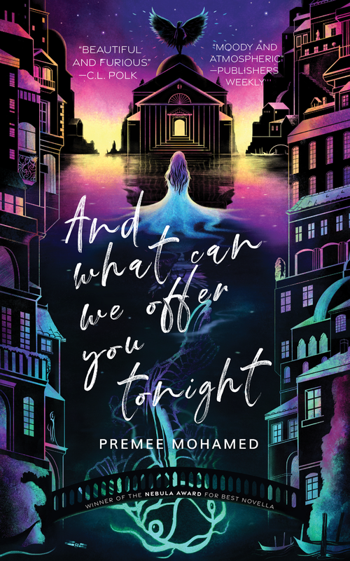
A-F: Mostly, I hope that I captured the beauty and danger in Premee's story, the cage and the breaking free. This remains a project that I am really proud of, and I was happy to see that dave and Premee were pleased with it, and it seemed to get a good reaction online. If my cover has helped encourage more readers to the book, that makes me very pleased. A beautiful book deserves a beautiful cover, and I did my best to make a cover worthy of the story.
ring: As someone who acquires books that speak to my own personal taste, I discovered that the novella’s reception in terms of reviews has been incredibly mixed, but I suppose I shouldn’t be surprised at all. The voice of the book is, as they say, a vibe, and if you bounce off of it, I can see how you’ll not enjoy the story. After the critical success it found, many folks picked it up who might not have been drawn to it otherwise, and said people seemed to be either charmed or bewildered.
Mohamed: I think it probably landed well with the readers I wrote it for (which is always the case, anyway), but I don't read 99% of my reviews so maybe everybody hated it, who knows.
Gailey: It certainly landed well enough to win a couple of serious awards.
Mohamed: The Nebula was quite something, though. I had read the others in the category and had decided (very firmly) that I knew exactly who was winning, so I made myself a nice big dinner and settled in to watch while texting a couple of my friends about the ceremony, and then I WON and nearly choked on my food. As we still joke, I ended up turning on my camera after a several-second delay (during which I was frantically chewing) and I had BACON IN MY TEETH for my acceptance speech. Like, I was literally mid-sentence in a message to a friend when I heard my name. I almost had a heart attack.
ring: The Nebula nomination was thrilling—the win was shocking. My DM to Premee in the moments that followed might have just been a string of exclamation points. When it won the World Fantasy Award as well it just felt surreal.
Mohamed: Semi-similarly, I forgot the date of the World Fantasy Award ceremony and was actually in Halifax for Hal-Con, and a friend had taken me to Fisherman's Cove for dinner, so I didn't find out I had won that one until I was coming back on the ferry and being like "Uh, why is my phone battery so low."
Mohamed: Big, big shout-out to dave, who really got what I was doing with the book, and convinced me that it had found its perfect home with Neon Hemlock; BIG shout-out to Martha Wells, who recused herself from the novella category and thereby was the reason I won the Nebula (which I didn't know till she mentioned it in her speech! I LOVE YOU MARTHA WELLS)
ring: Martha Wells is such a gem of a person.
Gailey: Looking back, how do you feel about what you made?
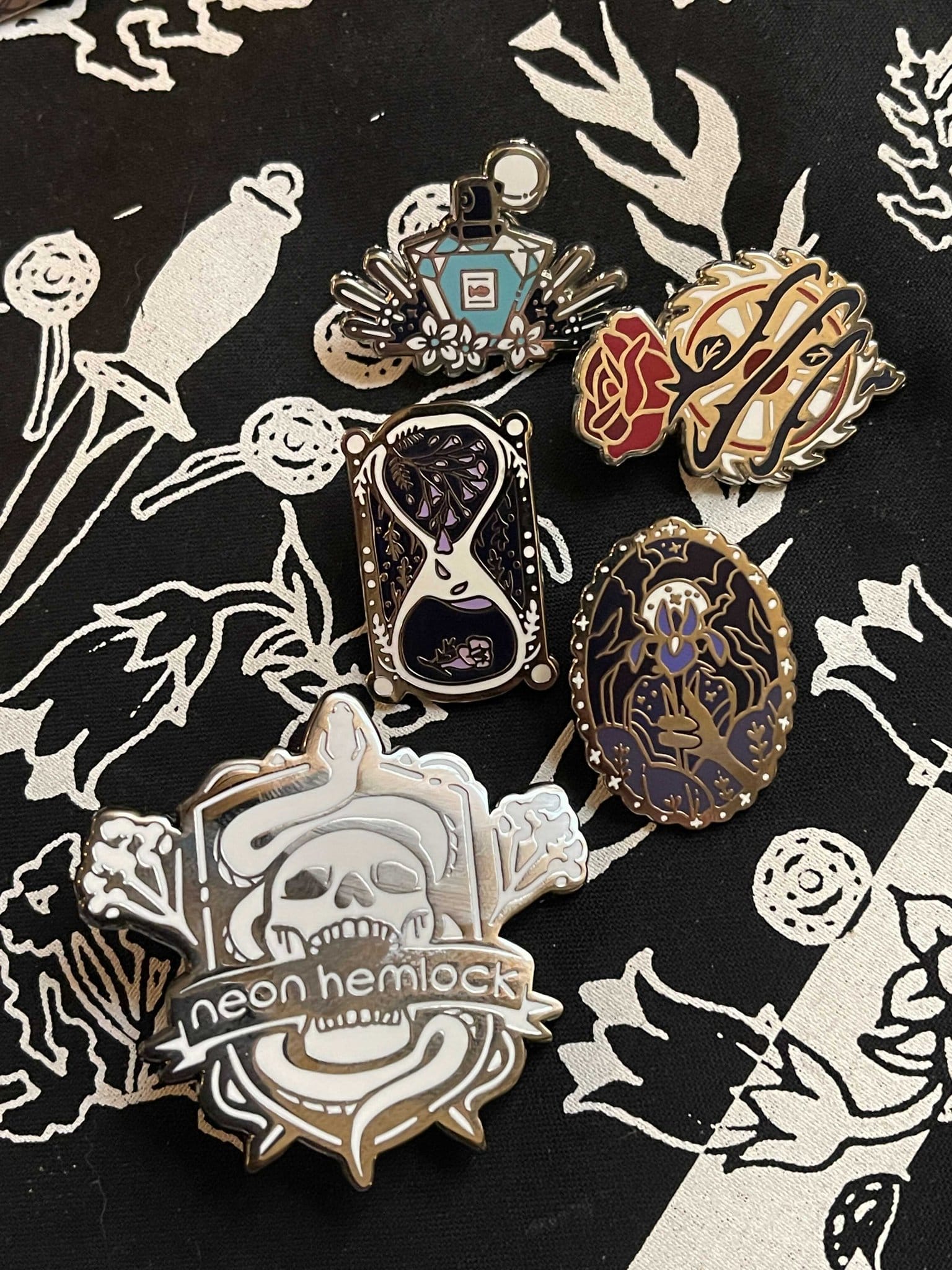
Mohamed: I don't think I have any post-pub regrets—it turned out to be a beautiful little book. It won two awards, and most importantly for me, it's still the book where I feel like I can most accurately announce "I said what I said." It was also deeply and meaningfully thrilling (because I am part-magpie) to have a special enamel pin for it (!!) as part of the Kickstarter, and a bespoke candle (I never got a candle, still sad about that three years later, hint hint dave, STILL SAD).
Gailey: This is an ideal project for a magpie heart given the amount of artwork commissioned for it (even if you didn’t get a candle). How did the interior art come into play?
Mohamed: dave and I were joking about removing all the Canadian u's from words like “honour, glamour, and splendour,” and we were like "That's practically the motto of House Bicchieri.” Before I even realized what was happening, dave had commissioned a literal house crest (which is now at the start of the book) from Kat Weaver and I think it was something like... a couple of hours from the joke to the file landing in my inbox.
Kat Weaver, Writer and Illustrator: dave reached out to me to commission a crest for the (terrible) luxury brothel where the main character works. dave had a strong vision, which fit comfortably within my visual wheelhouse. Predictably, the most challenging part was choosing a font. In reviewing my files, it looks like I gave dave about three options but I'd absolutely tried out/contemplated more. I do wonder now if I could've handwritten it, but honestly that might even have been more intensive than the actual drawing.
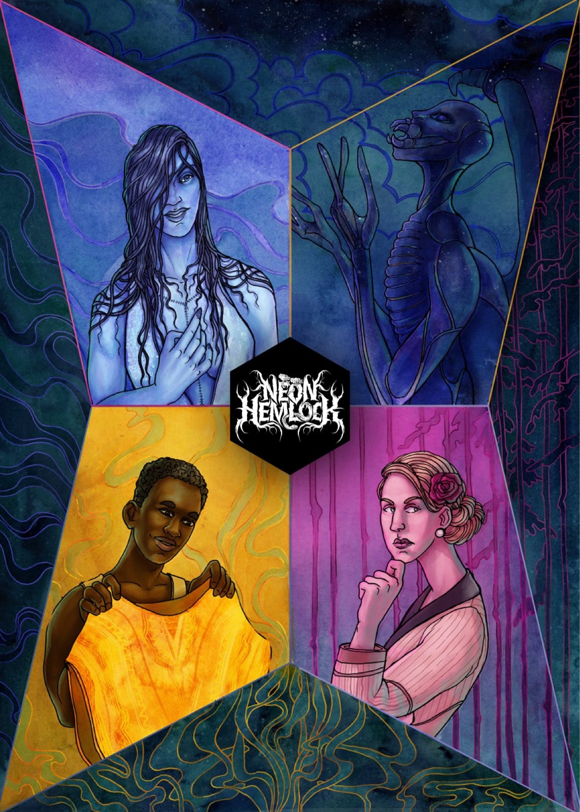
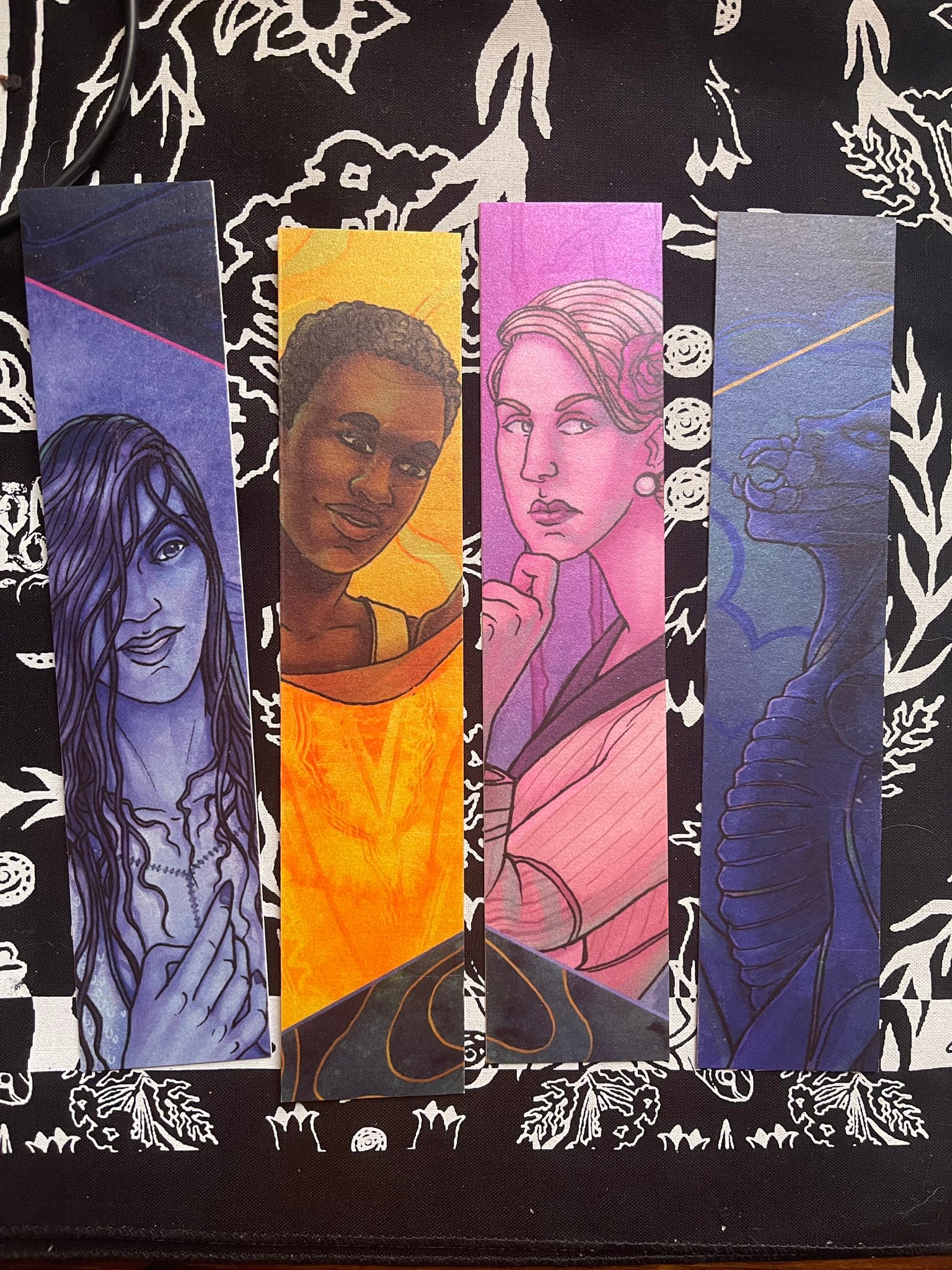
ring: Gosh, did I really never get Premee her candle? It’s probably in an unaddressed box somewhere in the depths of my office. I’m married to the chandler, so I know where to find a new one. As for the fonts, I’m sure I was just operating on vibes. Arriving at that illustration was definitely a case of there not being anyone to say no to me but myself, and I’m notoriously bad at that. That’s how we ended up with promo art from illustrator Matthew Spencer and enamel pins designed by Lauren Ring (no relation, ha).
Weaver: I really enjoyed choosing the flowers for the crest—all are mentioned in the text itself—in the second chapter: lilies, jasmine, and honeysuckle. I always love the little secret extra flourishes books can have, beyond cover and text. Interior illustrations in particular can make the reader think more about how intentional every aspect of a print book can be!
Gailey: It sounds like this part came together quickly and delightfully, which is rare in publishing.
Weaver: Shout-out to Premee for being into what I remember being a totally off-the-cuff idea, which dave made happen basically instantaneously.
Mohamed: It was SO funny and I thought it was an example of the best thing about small presses, which is that you're working so closely with your editor that you feel comfortable joking with them and there's a kind of creative freedom where they can be like "Well, let's just put a crest in the book, we don't answer to some giant committee of marketing or publicity nerds or an art department or whatever," and there it was!
ring: All in all, It’s been bracing to have such critical success with a title early on in our existence. Galvanizing, sure. I just can’t pretend that it hasn’t created some anxiety around knowing how to make lightning strike twice. We’ve had some great attention for our releases since then, but there’s definitely a part of me that wonders if a given title will resonate the way this one has. I don’t think of it in terms of there being a mold to try and fit a book into—AWCWOYT is very much so itself, and I expect each future success of ours will come from a book as equally itself.

Member discussion